«
May 2006 | Main
| July 2006
»
June 24, 2006
whew
I've been in a foul mood all week, and it was different from last week's bad mood because last week, I had a hopeful feeling that the mood would end. This week I just felt trapped in, well, the web. I've been working on updating my portfolio just about every spare moment, and during all the time that I haven't been working on it, I've been thinking about it, about CSS and sIFR and how stupid Internet Explorer is and self-presentation and screenshots.
But I'm done, finally, at 10:15 p.m. on a Saturday night. It may not look like it, but I put a lot of thought and effort into this. For the most part, I'm happy with how it turned out. I might change that photo at some point, but it's good enough for now.
Tomorrow I leave for Orlando, Florida to spend a few days there with my parents. It would seem just the right moment to die in a plane crash, after I've finished all this work that exists only to lead to more work. Though I'm proud of the portfolio, it doesn't exactly say anything meaningful about my life other than that I know how to please clients. So I'm saying superstitiously that I better not die. If I do die, you're going to feel very weird reading this, and in the moment that I realize I'm about to die I'll be thinking about this and feel weird, too. I feel weird right now, in fact.
Now I'm going to make banana muffins.
Oh, and my mood shifted completely today when I realized that I would not have to keep working on the site forever. I was just in a zone where the only thing that gave me any pleasure was working on it, and some other part of me was disgusted by that.
Many thanks to Andy for his support, his advice, and especially his patience. I don't think I've been very fun to be around lately.
June 19, 2006
cereal dater
Does this cereal look exciting to you? It might just be some oatmealy squares, but notice how overjoyed the milk is to be sharing the spoon with it!
This is totally disgusting. Not in a sexual way, in case you think I'm thinking that, but in a "whoa, look at all of this wackily posed, thick, unappetizing glue" way.
Quaker is not the only culprit (Post and Kellogg's are also offenders), but check out a sampling of Quaker's other shameful boxes in this image, taken from the back of the Oatmeal Squares box:
All of this actually appalls me a little bit. When did this crazy exaggeration of what milk looks like -- even "milk caught frozen in action by the energy of cereal pieces" -- start selling us our breakfast? Has it been going on for months? Years? I don't eat enough cereal to pay attention, and I didn't notice this trend until I visited the grocery store on the way back from dinner and drinks last month. In the lucidity of slight intoxication, I found all of this carefully constructed milk mania a little disturbing (and, of course, pretty funny).
Television commercials have been showing cereal splash into milky liquid for years, but that's not even what's happening in these images. I suppose we're supposed to think, at least on the Oatmeal Squares box, that the central piece of cereal has just rejoined its family on the expectant spoon (previously it had been, I guess, flying through the air after you poured it out of the box, and you were aiming not for the bowl, but for the spoon, naturally), and that the force of the landing caused a beautiful splash. But the shadows make it look as though it hasn't quite landed yet. And the white stuff just looks so much like glue and so little like milk that it becomes, if you look at it for more than two seconds, ridiculous.
It's almost as though the milk is mocking us for requiring such acrobatics from it, for being so desensitized that we need the product to seem as though it actually is in motion. The cereal knows we know that real milk doesn't look like that and it's laughing at us for even daring to think, for essentially condoning the idea, that breakfast might be this wild. What I'm forgetting is that cereal is trying to get kids to get their parents to buy it for them. Still, I think all of this glue business is kind of insulting, even to kids, who probably noticed it long before I did.
This reminds me of my e-mail exchange with the person at Kleenex who told me that they use animators to aid in design of their boxes. Surely animated product packaging will happen some time this century, and what a nightmarish prospect! But before such technology exists, there will be other developments in cereal packaging, and I promise to be at the forefront of the action, bringing you complete and thorough coverage of this important story as it unfolds.
June 14, 2006
weekend times
You already know so much about how I've been spending my newly free weekdays (making shorts, making lunch, bookmarking clothes on the internet -- I apologize to everyone in my del.icio.us network for the recent spate of links to items from Forever 21), but what about my weekends, which are also free, still?
Well! Remember how I won that bike? I rode it for the second time in the Tour de Brooklyn on the first weekend of June! Here are some photos:
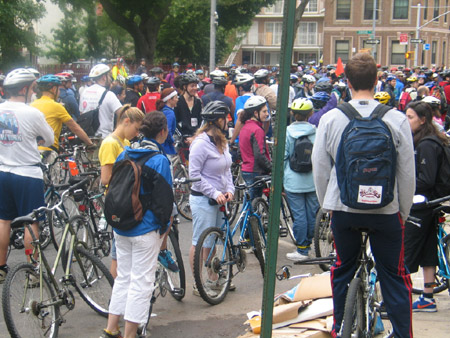
This is what the people looked like, in general.
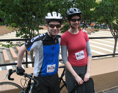
This is Chris and me looking athletic. Also my dad visited and rode with us. It was fun, even though I felt really weird the whole time because I'd had insomnia the night before and had only gotten one hour of sleep. I recommend this tour to everyone who has a bike. It was easy, especially because you didn't have to worry about trucks running over you, like I always do.
Okay, then last weekend I went to Andy's five-year college reunion:
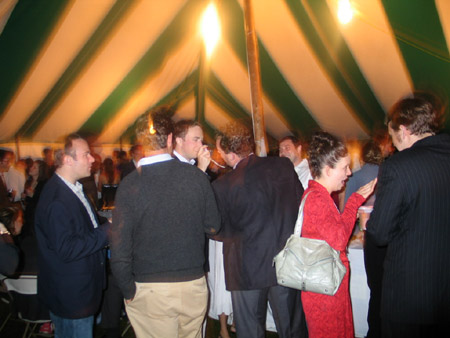
This is what the people looked like, in general.

This is Andy eating a cracker.
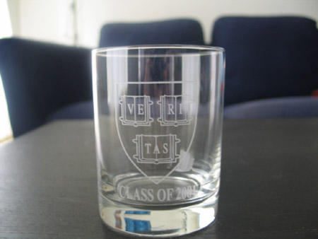
This is one of four tumblers I got for pretending to have been a student and paying a lot of money to eat dinner at the thing. Also I am in the class reunion photo. Going to the reunion made me feel one year younger and four years fancier. Not really, I just thought of that a couple of days ago and wanted to put it in. Do you know how hard it is to take a picture of etched glass, if that is what this kind of glass is called? Pretty hard. Also, not to complain about a generous gift I wasn't meant to receive, but these are pretty ugly.
I'm sorry about the annoying tone of this entry. I've been sitting here all day waiting for UPS to deliver something (yesterday, surprise, I missed them). As a result, I haven't showered yet (it's almost 1:30), and, since I still haven't bought groceries this week, I just now ate a pita with too much shredded cheddar cheese on it for lunch. I feel a little bit gross. Also sometimes I just want to write in a kind of silly, childish way to amuse myself, but I feel like there's no acceptable forum for that. And by forum I mean public forum, because keeping a private journal is unsatisfying unless you know that it will one day be discovered and published, winning you a plentitude of admirers. We are so oversaturated with words, though, aren't we? As a society? As a world? I don't really feel like that about private journals. I think they can come in handy for working things out.
** 6.16.06 ADDENDUM **
I think that I, in my moodiness (which has mysteriously persisted for days despite nothing particularly different in the days' characters from normal days on which I feel good), mistakenly gave the impression that I was making fun of the above-mentioned events, though I honestly enjoyed them thoroughly. To alleviate my guilt, I am now going to thank everyone I should have thanked in the original post. Thank you to my dad for coming up to spend that Sunday here; it's always nice to spend time with you, Dad. Thank you to Transportation Alternatives for successfully orchestrating a safe, feel-good, completely free event that included surprisingly decent food. Thank you to Andy's mom for contributing to the cost of the reunion; it was very generous and helped me relax about having decided to go. Thank you to Andy's sister for hosting us in her spacious yet cozy apartment, for tolerating the song Andy kept playing on the thumb piano, and for going out to brunch with us on Sunday; it was fun! Thank you to Andy's college for the good food and drink and overall niceness. And thank you also to Andy's college for the tumblers. But Andy's college, so that next year's tumbler recipients may be better served, the crest should be smaller and the lettering should not be squished (use Goudy, possibly?). And maybe the glasses themselves could be a little more elegant.
June 08, 2006
home economics
I bought a sewing machine a couple of weeks ago, and after staring at it in my living room for days and worrying that I'd never be able to thread it, let alone actually use it, I finally sat with the instruction book and repeated its directions out loud a lot and slowly set everything up. Then I turned it on and ran some fabric through it and realized that sewing in a straight line takes more skill than I currently possess.
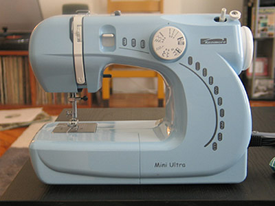 I like everything about the machine's design except the use of Comic Sans for its name. I first thought it was a Comic Sans imitation (whether that's worse or better, I'm not sure), but no, it's the real deal. Do you know how many businesses use this font in their actual businessy documents? I have seen inside these trenches, and I have seen Comic Sans. I think that sometimes people want to shake things up a bit and add some fun and casual flavor to their corporate material, and there's (usually) nothing wrong with that. But they need to be given better options, and the bad options need to be removed. So I think a font contest should be held by the government to figure out a better way to connote friendliness in our corporations and products than this ugly, silly typeface. The winning font would be installed automatically on all PCs through a Windows Update that would simultaneously remove Comic Sans from users' computers. (We'd figure out a similar solution for Mac users.) The winner would receive a gold medal, an oversized check for $10,000, and a fancy framed document with the full typeset on the left and a signed thank-you letter from the president on the right. This contest would be called "Sans Comic Sans: A Better Font for a Better Future."*
Meanwhile, in sewing land, I have completed my first project: making some long shorts out of a pair of jeans that were too short to wear as pants.
Don't look too closely at the stitches (not that this photo allows for it). I am pretty proud that I can actually wear these outside and not feel like people will be able to tell how bad a job I did. Eventually I would like to be able to make clothes from scratch; it's been a dream since high school. Maybe after I botch up most of the less popular items in my closet I'll be able to tackle something more inventive.
*The main problem with Comic Sans, as I hinted, is that it's misused. Its original purpose was for use in cartoon bubbles containing words "spoken" by cartoon animals in Microsoft Bob, but its first appearance was in Microsoft 3D Movie Maker, which also used cartoon bubbles. In 1995 it started getting shipped with Windows computers, and it then became one of the default fonts for Microsoft Publisher and Internet Explorer.
|

